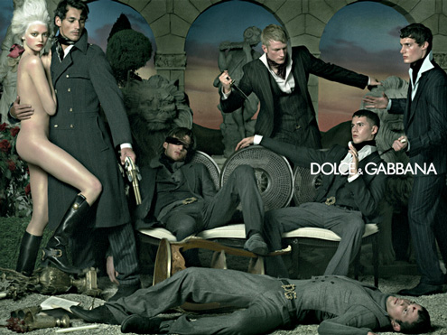
A banned D&G advertisement for Fall/Winter 2006.
In a Stockholm newspaper DN October 30, 2007 were an interesting article on redefining luxury, it’s changing premises and its spreading to the middle class rather than being exclusive to the ”absurdly affluent”. I can’t help seeing the new D&G advertising for their latest collection in this light. It is quite obvious that they are trying to reach a different crowd than those who bought the original LV bags of the 1920s and crossed the Atlantic twice a year to spend the summer season in France, so much is clear.
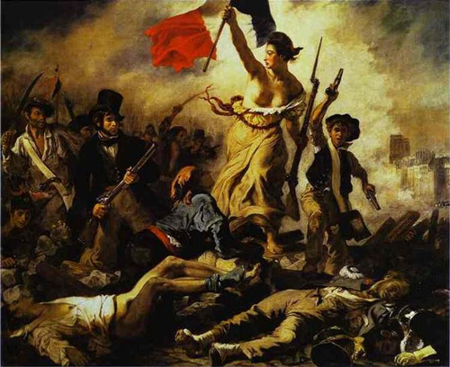
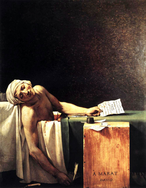
Print advertisements for Dolce & Gabbana (D&G) clothing, fashionably un-affective in expression but featuring a knifing, have been banned in Britain by UK’s Advertising Standards Authority after drawing 166 complaints. D&G explained that its latest collection was designed to evoke the Napoleonic period and that the related advertisement took its inspiration from well-known paintings by Delacroix and David. The advertisements had run in the US, Europe, China, Hong Kong and Japan without complaint.
”Visual language is not transparent and universally understood, but culturally specific” (Kress and van Leeuwen, 1996:3), who continues:
Western visual communication is deeply affected by our convention of writing from left to right. Other cultures write from right to left, or from top to bottom and will consequently attach different values and meanings to these key dimensions of visual space. Such valuations and meanings will exert their influence beyond writing, and inform the meanings accorded to different compositional patterns, the amount of use made of them, and so on.
With the thought that all advertisements are meant to promote a brand name and positively build the branding of the fashion house, the question is – how will this advertisement be conceived and understood in the various cultures of the world where it has been launched?
Then there’s also the the argument that advertising works on the subconscious level (Parker and Furnham, 2007). People often ’absorb’ pictures and advertisements rather than deconstruct them and unravel their underlying meanings.
How many of us sitting on the subway either going to work of coming back home, upon encountering this D&G advertisement on either a billboard or a magazine, would contemplate its likeness to Delacroix and / or David?

Liberty Leading the People by Eugene Delacroix, Louvre. The painting is very well known in arts history and commemorates the French ’July Revolution’ in 1830 where the middle class rose against Bourbon King Charles X and forced him out of office. A woman personifying Liberty leads the people forward with the flag of the French Revolution in one hand and a rifle with a bayonet in the other.
Yes, this is certainly what immediately comes to all our minds, when seeing the D&G advertisement on the billboards; – Yes, aha, a 21st century Delacroix leading the consumer to victory over, bad taste?
The second artist D&G are referring to is Jacques-Louis David, (1748-1825). Another interesting choice I would say. To me, if someone says David, I say Marat. He’s the dead guy in the bathtub, below. This painting is older than the one above; from the time of the French Revolution 1789, the one with the beheading of Marie Antoinette to put things in order. While Marat was a revolutionist agitator and writer, the artist David was a hardcore revolutionary. Historians have identified more than 300 victims for whom David signed execution orders. The greatness of this painting rests in no small measure on the writings of Baudelaire, who revived the painting back to public interest when he in 1846 wrote: ”This is food for the strong, the triumph of spiritualism. This painting is as cruel as nature but it has the fragrance of ideals. Where is the ugliness that hallowed Death erased so quickly with the tip of his wing? Now Marat can challenge Apollo. He has been kissed by the loving lips of Death and he rests in the peace of his metamorphosis.”

Death of Marat, Jacques-Louis David, (1748-1825), The Metropolitan Museum of Art; New York City.
We can possibly, also associate to David’s The Sabine Women, also in the Louvre. That is later. Having survived the revolution and following reign of terror David cooled off and went into paintings where the warriors were nude. Inspired by classical Greek sculptures of Gods and Heroes ”he wanted to refine, and strip away anything that was unnecessary, to reduce everything to a supreme, heroic simplicity”. Ok, maybe a better inspiration for an ad campaign, but isn’t this a bit far fetched?
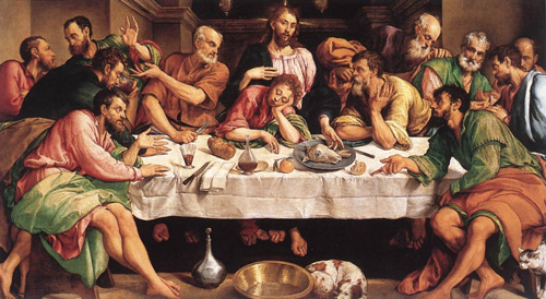
On my part, I associated the D&G advertisement more to the oil on canvas by Jacopo Bassano on The Last Supper. I see the parallels in the placing of the knives on the table, the threatening gazes, the open palms of giving in, plotting or denying; the underlying menace of the cut-off goat’s head on a plate and a symbol of the sacrificial Christ who came to give his life, and his death would purchase salvation for others (Matthew 26:28). In D&G’s advertisement we have the man holding a naked woman, a symbol of Mother Nature and re-creation itself etc.
1542; Oil on canvas; Galleria Borghese, Rome
From ibiblio.org:
Jacopo Bassano’s Last Supper is one of the masterpieces of 16th-century Italian painting. Instead of the elegant grouping of figures in Leonardo’s painting, which inspired it, this dramatic scene features barefoot fishermen at the crucial moment when Christ asks who will betray him, and the light passing through a glass of wine stains the clean tablecloth red.
All in all I find the references to art weak and probably not very important. Today’s mass media and culture is not that much aware of what’s in the Louvre and for quite some today, Marie Antoinette is a movie. So what we are left with in the D&G advertisement is its underlying effect of normalizing, glamorizing or even glorifying violence. We need to assume that this is why the consumers reacted as negatively as they did in Great Britain. That or they really, really don’t like French paintings.
But what about the other viewers who did not call in a complaint but simply absorbed the message, and just reacted by association or disassociation with the brand? What is that picture really telling to the average consumer? It could ironically be ”Street violence is here to stay. So let’s do it with style, in D&G.” How’s that for a 21st century slogan? And who are the consumers? Is it the gangster rap artist or drug lords; invest your hard earned crack-money in some flashy clothes. Or is it the middle class who secretly want to live out their Scarface and Soprano’s fantasies? Get respect; wear D&G, and a knife.
How much of the consumer market would then feel discomfort or disgust and begin to turn away from or disassociate themselves with the brand D&G and their products, simply because they do not share the ideology (in the critical linguistic sense) of normalizing violence?
The more damaging viewer interpretation for D&G is that D&G is condoning violence and consumers will be reminded when they wear that D&G cologne or those sunglasses; that they in some sense take part in the discourse of normalizing violence.
Visuals are also interpreted and understood differently depending on one’s culture. I am pretty sure that very few in China, Hong Kong and Japan have heard about either David or Delacroix. More likely they will think yacuza, cheap Samurai movies and Drug Triads. All established Eastern entities via their movie industry.
Also in Asian societies, how others see you and what they say about you is very important. While being very collective, they also happen to be quite ambitious and thus, rather brand conscious. One question here is how much of that market will be affected by not what the target group thinks but what the target groups peers think. The reality is that if a parent, a patriarch or matriarch dislikes the brand, its dead.
I don’t take any public stance on this. Its noteworthy though that D&G have also one advertisement out there that was banned in Spain, suggesting gang rape.
The effect of advertisements is both long term and short term. Some will show at once in the shops. Some will take its time. What next is there to make fashionable. Suicide bombers? Maybe that has been done already? Man, fashion is moving sooooo fast.
References
- Kress, G. and van Leeuwen, T., 1996. Reading Images: the grammar of visual design. London, New York: Routledge.
- Parker, E. and Furnham, A., 2007. Does Sex Sell? The Effect of Sexual Programme Content
on the Recall of Sexual and Non-Sexual Advertisements. Applied Cognitive Psychology.
